Mobile Web App
Principles and Practical How-to
Presented by Tran Trong Thanh / @trongthanh
What is a Mobile Web App?
An application
- created with Web technology
- on handheld form factors
(smartphones, tablets) - run on mobile web browser*
- normally have touch interface
- offline or online, connected through
mobile network or wi-fi
* not include proxy browsers
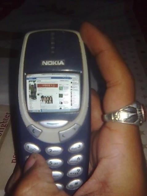
Examples of Mobile Web Apps
- Financial Times Web App
- SCB Breeze Biz
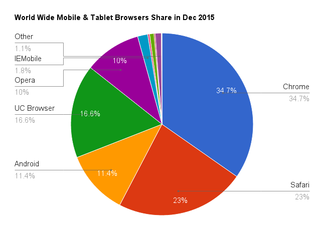
Major Mobile Web Browsers
Principles
- HTML5 & CSS3
- Responsive Web Design (RWD)
- Touch Interface
- Optimization
- Testing
One Must Know
HTML5 & CSS3
UI & Animation Effects With CSS3
- Web fonts for custom typography
- Transitions for interaction indicators
- Animations for state transitions
- UI decorations with shadows, border radius, gradients, filter...
Built-in HTML5 Inputs
Make use of built-in inputs and interactive elements.
Your custom JS components can't beat the native one.
<input type="date">
<input type="time">
<input type="month">
<input type="range">
<select>
	<option value="">Jump To Section:</option>
	<optgroup label="Introduction">
		<option value="about">About</option>
	</optgroup>
	...
</select>
Link: all built-in iOS Safari inputs
* Range input is customized with CSS for better interaction.
Present To Users The Correct Keyboard
Beware of Default Text Selection
- Text in browsers are always selectable (try select me)
- Generally, we should disable text selection to avoid unxepected behaviors
/* Disable text selection for all */
* {
	-webkit-user-select: none;
}

/* Enable back text selection on text inputs */
input, textarea {
	-webkit-user-select: text;
}
Tap Highlight Can Generally Be Removed
And use :active instead
/* disable tap highlight color */
* {
	-webkit-tap-highlight-color: rgba(0,0,0,0);
}

/* use pseudo class :active instead */
.tappable:active {
	transform: translateY(2px); /* browser prefix needed */
}
Hardware Accelerated Rendering
HWA rendering through CSS3's 3D transform
/* Enable HWA on a particular element */
.hwa {
	-webkit-transform: translate3d(0, 0, 0);
	-ms-transform: translate3d(0, 0, 0);
	-o-transform: translate3d(0, 0, 0);
	transform: translate3d(0, 0, 0);
}
Note: only use HWA rendering when needed.
Overuse may cause GPU memory shortage and result in crash/hang.
Source: Why Moving Elements With Translate() Is Better Than Pos:abs Top/left
HTML5 Device API
- Geo Location
- Device Orientation (Accelerometer & Compass)
- Battery Status Events
- Vibration API
- Abient Light Events
- Network Info API (currently Phonegap)
- ...
Geo Location Example
if ('geolocation' in navigator) {
    /* geolocation is available */
    navigator.geolocation.getCurrentPosition(function(position) {
        alert('Your position: ' + position.coords.latitude + ' - ' + position.coords.longitude);
    }); //second param is fail handler
} else {
    alert('Your browser doesn\'t support Geolocation API');
}
Device Orientation API Demo
http://girliemac.com/magic8ball/Responsive Web Design (RWD)
Is A Must
Common Practices
- Avoid absolute units (i.e: px, pt)
- Try to make layout fluid with %
- Try to make components scalable with
em, rem - Make use of new size units:
vh, vw, vmin, vmax - Use a mobile-friendly grid framework
- Layout with Flexbox
Notes on Meta Tags
<head>
	...
	<!-- Allow the app to runs in fullscreen mode -->
	<meta name="apple-mobile-web-app-capable" content="yes"/>
	<!-- Control the status bar appearance in fullscreen mode (new in iOS7) -->
	<meta name="apple-mobile-web-app-status-bar-style" content="black">
	<!-- Control viewport sizes, scaling... behaviors -->
	<meta name="viewport" content="width=device-width,height=728,
	initial-scale=1,minimum-scale=1,maximum-scale=1,user-scalable=no">
	<!-- Disable/enable telephone number detection -->
	<meta name="format-detection" content="telephone=no">
	<!-- Place favicon.ico and apple-touch-icon.png in the root directory -->
	...
</head>
Link: iOS Safari supported meta tags
Link: Mobile Boilerplate
Notes on Retina Display
logo.png
logo@2x.png
logo.svg
- Use SVG / icon fonts whenever possible
- Use media query to swap hi-res images (backgrounds only)
@media (-webkit-min-device-pixel-ratio: 2), (min-resolution: 192dpi) { /* Retina-specific stuff here */ } - Use a responsive image solution*
*Link: Responsive image solution
You Must Embrace
Touch Interface
Touch Events
Mouse Events
(desktops)
- mousedown
- mousemove
- mouseup
- mouseenter (IE)
- mouseleave (IE)
- mouseover
- mouseout
Touch Events
(mobile webkit and the like)
- touchstart
- touchmove
- touchend
- touchenter
- touchleave
- touchcancel
Pointer Events
(IE Mobile*)
- pointerdown
- pointermove
- pointerup
- pointerenter
- pointerleave
- pointerover
- pointerout
- pointercancel
* In IE10 Mobile, it is
MSPointerDown, MSPointerUp...
Handling Interactive Events Across Platforms
$('#foo').on('click', function() {
    //stuff
});

$('#foo').on('mouseup touchend MSPointerUp pointerup', function(event) {
    //stuff
});

var POINTER_END = 'mouseup';
if      ('ontouchend' in window)    { POINTER_END = 'touchend'; }
else if ('onmspointerup' in window) { POINTER_END = 'MSPointerUp'; }
else if ('onpointerup' in window)   { POINTER_END = 'pointerup'; }

document.getElementById('foo').addEventListener(POINTER_END, function() {
    //stuff
});
The Great 300ms Delay
document.addEventListener('DOMContentLoaded', function() {
    //enable FastClick
    FastClick.attach(document.body);

    document.getElementById('fastclick-btn').addEventListener('click', function(e) {
        clickNote.textContent += 'Click! ';
    });
});
Link: FastClick library
Update: New workarounds for 300ms delay on major mobile browsers
Scroll with momentum
iOS Overflowed Elements
Not Smooth
Pellentesque habitant morbi tristique senectus et netus et malesuada fames ac turpis egestas. Vestibulum tortor quam, feugiat vitae, ultricies eget, tempor sit amet, ante. Donec eu libero sit amet quam egestas semper. Aenean ultricies mi vitae est. Mauris placerat eleifend leo.
Pellentesque habitant morbi tristique senectus et netus et malesuada fames ac turpis egestas. Vestibulum tortor quam, feugiat vitae, ultricies eget, tempor sit amet, ante. Donec eu libero sit amet quam egestas semper. Aenean ultricies mi vitae est. Mauris placerat eleifend leo.
Smooth
Pellentesque habitant morbi tristique senectus et netus et malesuada fames ac turpis egestas. Vestibulum tortor quam, feugiat vitae, ultricies eget, tempor sit amet, ante. Donec eu libero sit amet quam egestas semper. Aenean ultricies mi vitae est. Mauris placerat eleifend leo.
Pellentesque habitant morbi tristique senectus et netus et malesuada fames ac turpis egestas. Vestibulum tortor quam, feugiat vitae, ultricies eget, tempor sit amet, ante. Donec eu libero sit amet quam egestas semper. Aenean ultricies mi vitae est. Mauris placerat eleifend leo.
.scroll-box {
	width: 200px;
	height: 200px;
	overflow-y: scroll; /* has to be scroll, not auto */
}

.touch {
	-webkit-overflow-scrolling: touch;
}
iOS scroll Events Not Dispatched on Momentum
It finally works on iOS8!
Pellentesque habitant morbi tristique senectus et netus et malesuada fames ac turpis egestas. Vestibulum tortor quam, feugiat vitae, ultricies eget, tempor sit amet, ante. Donec eu libero sit amet quam egestas semper. Aenean ultricies mi vitae est. Mauris placerat eleifend leo.
Pellentesque habitant morbi tristique senectus et netus et malesuada fames ac turpis egestas. Vestibulum tortor quam, feugiat vitae, ultricies eget, tempor sit amet, ante. Donec eu libero sit amet quam egestas semper. Aenean ultricies mi vitae est. Mauris placerat eleifend leo.
Pellentesque habitant morbi tristique senectus et netus et malesuada fames ac turpis egestas. Vestibulum tortor quam, feugiat vitae, ultricies eget, tempor sit amet, ante. Donec eu libero sit amet quam egestas semper. Aenean ultricies mi vitae est. Mauris placerat eleifend leo.
Pellentesque habitant morbi tristique senectus et netus et malesuada fames ac turpis egestas. Vestibulum tortor quam, feugiat vitae, ultricies eget, tempor sit amet, ante. Donec eu libero sit amet quam egestas semper. Aenean ultricies mi vitae est. Mauris placerat eleifend leo.
var output = document.getElementById('scroll-output');
var scrollBox = document.getElementById('scroll-box');

scrollBox.addEventListener('scroll', function() {
	output.value = scrollBox.scrollTop;
});
Work around: use iScroll library
Hover State on Touch-enabled Browsers
- On Webkit browsers,
:hoverstate is triggered after first tap and mantained until user tap again on another target. - This behavior help menu dropping down on mouse's hover continue to works
- Example:
.submenu { position: absolute; overflow: hidden; height: 0; opacity: 0; transition: height 0.5s, opacity 0.5s; /* browser prefix needed */ } .menu:hover .submenu { height: 400%; /* there are 4 items */ opacity: 1; } - However, this won't work on IE Mobile
Design for Touch Friendly Interface
- Minimal touch area is 40px
- Mind that there is no hover state on mobile
- Mind the way users holding the screen
- Avoid hidden gestures without visual cues or fallback actions
- Always assume that mobile users have limited data
- Maximize interface for content
- Read The Mobile Book
- Read Don't Make Me Think - 3rd Edition
Push
Web App Optimization
To The Next Level
Reduce The Size of Resource Transfered to Device
- Practice page load optimization
-
Avoid big, legacy libraries
Examples: jQuery 1.x:
jQuery 2.x:
Zepto: 93.5KB
82.3KB
24.1KB
RequireJS:
AlmondJS:
14.9KB
4.9KB
(Latest production builds as of 5/2014) - Deliver different assets / contents to
mobile users (if possible)
Performance Optimization
- Reduce number of DOM objects -> less elements, simplify structure
- Optimize jQuery, vanilla JS is preferred
- Rendering / drawing optimization
- Avoid / suppress touch event listeners where possible
- Avoid too much visual effects
- Put HWA tricks to good use
- Use CSS animation instead of JS' animate script*
- Use
requestAnimationFrameinstead ofsetInterval*
* A good animation library like GSAP will help using the best approach
Mobile Web Testing
Chrome Simulation
Demo
Adobe Edge Inspect
Demo
Real Device Testing with Debugger
iOS Safari with OSX Safari developer tool demo
Android Chrome with desktop Chrome devtool demo
Mobile UI Frameworks, YES or NO?
Some welknown Mobile Frameworks:
Thank you!
Any questions?
About
This presentation was first presented in June 2014 by Thanh Tran for Nau Studio team.
Revised first time on January 2016
The slides is powered by RevealJS presentation framework with a modified Beige theme.
Source code of the slides is available on github.
© 2016 Nau Studio. All rights reserved.