The Ultimate Solution to
Web Layout
About me:
Trần Trọng Thanh
Co-founder & CTO Nau Studio
Front End Specialist
Github, Twitter, Facebook: @trongthanh
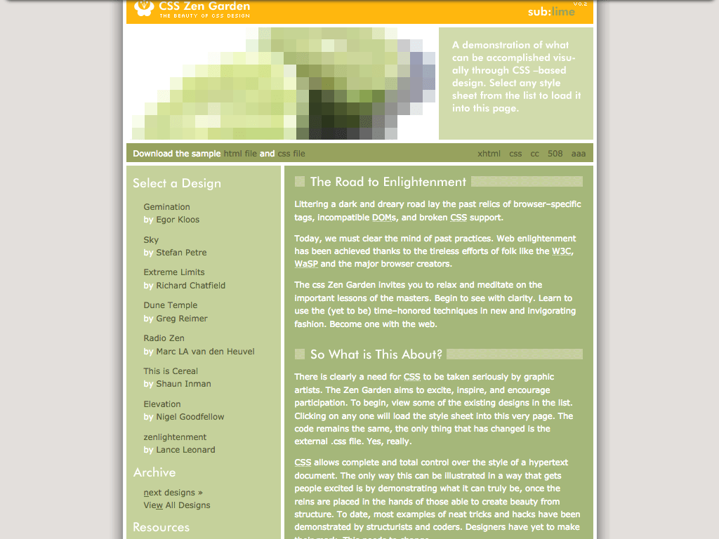
A brief history of
Web Layout
No layout
No layout
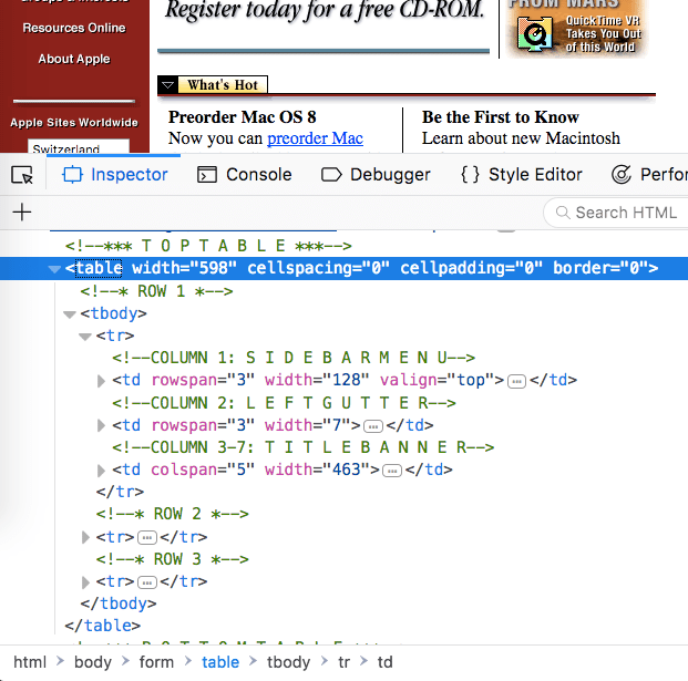
Tables
Tables
- Tables are not meant for layouts
- Unfriendly with screen readers
- Fixed width
No layout
Tables
Floats
Floats
CSS Floats were created to imitate print layout counterparts
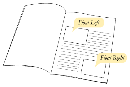
Floats
<p>...
<img class="float-left" src="...">
...</p>
.float-left {
float: left;
}The float CSS property specifies that an element should be placed along the left or right side of its container, allowing text and inline elements to wrap around it.
 The element is removed from the normal flow of the web page, though still remaining a part of the flow (in contrast to absolute positioning).
A floating element is one where the computed value of float is not none.
As mentioned above, when an element is floated, it is taken out of the normal flow of the document (though still remaining part of it). It is shifted to the left, or right, until it touches the edge of its containing box, or another floated element.
The element is removed from the normal flow of the web page, though still remaining a part of the flow (in contrast to absolute positioning).
A floating element is one where the computed value of float is not none.
As mentioned above, when an element is floated, it is taken out of the normal flow of the document (though still remaining part of it). It is shifted to the left, or right, until it touches the edge of its containing box, or another floated element.
.wrapper {
  border: 4px solid black;
}
.main-content {
  background-color: blue;
}
.sidebar {
  background-color: red;
}
.wrapper {
  border: 4px solid black;
}
.main-content {
  background-color: blue;
  float: left;
}
.sidebar {
  background-color: red;
  float: right;
}
.wrapper {
  border: 4px solid black;
}
.main-content {
  background-color: blue;
  float: left;
}
.sidebar {
  background-color: red;
  float: right;
}
.clearfix::after {
  display: block;
  content: '';
  clear: both;
}

Floats
- Need clear-fixes
- No center method
- Cannot control column's height
No layout
Tables
Floats
inline-block
inline-block
.wrapper {
  text-align: center;
}
.item {
  display: inline-block;
}
Inline-block
- Implicit inline character spacing
- text-align are inherited in child elements
- Popular grid frameworks use floats
<ul class="menu">
  <li>Home</li><!-- no space
--><li>About</li><!-- no space
--><li>Pricing</li><!-- no space
--><li>Contact</li>
</ul>
No layout
Tables
Floats
inline-block
Flex Box
Flex box
Flex box
Flex box
- One directional layout method
- Full page layout with flex boxes are still hacky
No layout
Tables
Floats
inline-block
Flex Box
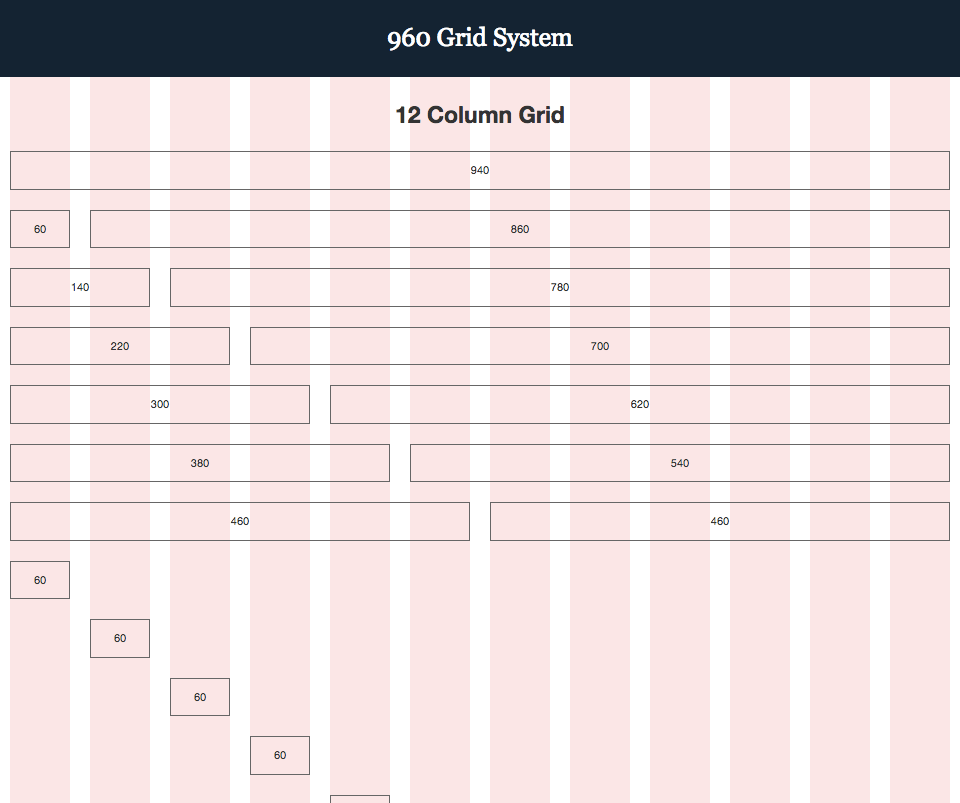
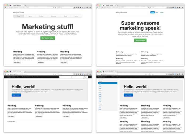
CSS Framework

Problems:
- We've been learning hacks to do web layout
- Current tools are one directional, content-out
- Frameworks and fixed grid limit creativity
- Layout with CSS is hard!
Solution?
No layout
Tables
Floats
inline-block
Flex Box
CSS Framework
CSS Grid
CSS Grid Concepts
- Grid container
- Grid item
- Grid line
- Grid track
- Grid gap
- Grid cell
- Grid area
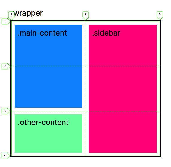
Grid container
Elements containing a grid, defined by setting display: grid
  ﹤header class="main-header"﹥﹤/header﹥
  ﹤div class="main-content"﹥﹤/div﹥
  ﹤div class="other-content"﹥﹤/div﹥
  ﹤aside class="sidebar"﹥﹤/aside﹥
  ﹤footer class="main-footer"﹥﹤/footer﹥
.wrapper {
  display: grid;
}
Grid item
direct children of grid container
﹤main class="wrapper"﹥
(Here: grid items are children of main.wrapper)
Grid line
Invisible lines divide the grid into sections.
Grid lines order respect writing direction
Grid lines are 1-based!
Grid track
A grid track is the space between any two lines on the grid.
Grid tracks are content rows and columns
Grid track
Defined at container:
.wrapper {
  display: grid;
  grid-template-columns:
    1fr 1fr 1fr 1fr;
  grid-template-rows:
    1fr 1fr 1fr 1fr;
}
Grid cell
Intersection between grid row and grid column. Conceptually it is like a table cell.
Grid cell
Grid items are auto placed in cells with the order of grid lines.
Rows are implicitly inserted if there are more items than cells.
Grid cell
Or they can be manually placed with:
.cell {
  grid-column-start: 2;
  grid-column-end: 3;
  grid-row-start: 2;
  grid-row-end: 3;
}Grid area
Rectangular area between 4 grid lines.
.area {
  grid-column: 1 / 4;
  grid-row: 2 / span 2; /*(1)*/
}Grid gap
Gutters or empty spaces between grid tracks
.wrapper {
  display: grid;
  grid-template-columns:
    repeat(4, 1fr);
  grid-gap: 10px;
}Looks promising!
If current methods work though,
what are other benefits of CSS grid?
CSS Grid
- Multi-dimension & layout-in approach
- More intuitive and easier to learn
- No more grid framework and fixed grid system
Simplify HTML markups

<section class="o-section">
  <div class="o-content-container">
    <div class="o-row">
      <div class="col-8">…</div>
      <div class="col-4">…</div>
    </div>
    <div class="o-row">
      <div class="col-1"></div>
      <div class="col-3">…</div>
      <div class="col-8">…</div>
    </div>
  </div>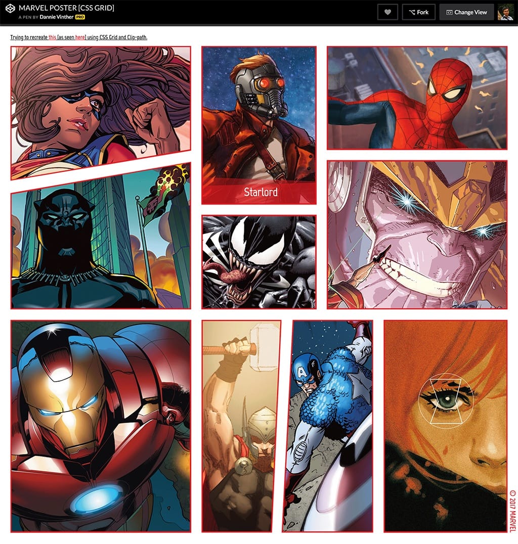
</section><section class="c-photo-collage
c-photo-collage--three">
<img src="example-1.jpg" alt="">
<img src="example-2.jpg" alt="">
<blockquote class="c-quote">
<p class="c-quote__text">…</p>
</blockquote>
<img src="example-3.jpg" alt="">
</section>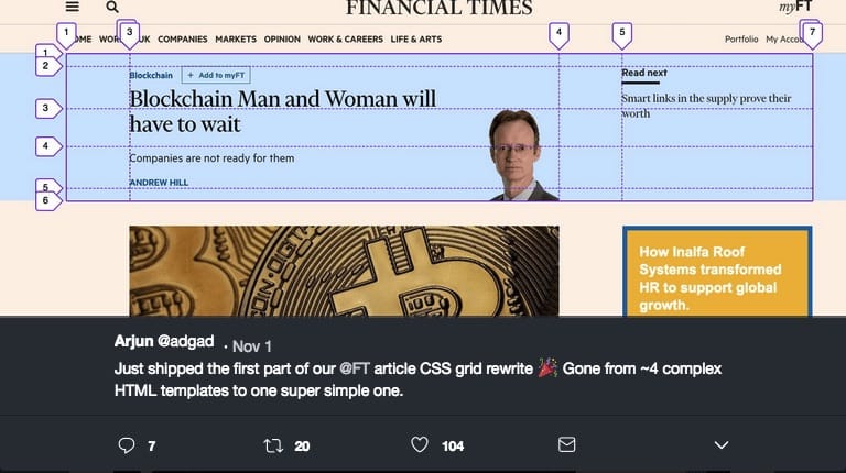
More intuitive responsive layout setup
.wrapper {
  display: grid;
  grid-gap: 1rem;
  grid-template-columns: 1fr;
  grid-template-areas:
    "header"
    "content"
    "sidebar";
}
.header { grid-area: header; }
.content { grid-area: content; }
.sidebar { grid-area: sidebar; }@media (min-width: 768px) {
.wrapper {
grid-template-columns: 1fr 2fr 2fr;
grid-template-areas:
"....... header header"
"sidebar content content";
}
}New ways to RWD that were not
possible with old methods
https://codepen.io/andybarefoot/full/MERBPx
https://codepen.io/dannievinther/full/EvVggR/
CSS Grid Looks Awesome!
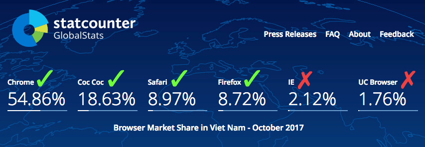
What about browser support?
Can I use it now?
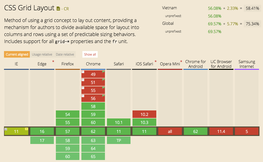
 66
66
OK. What do I do with older browsers?*
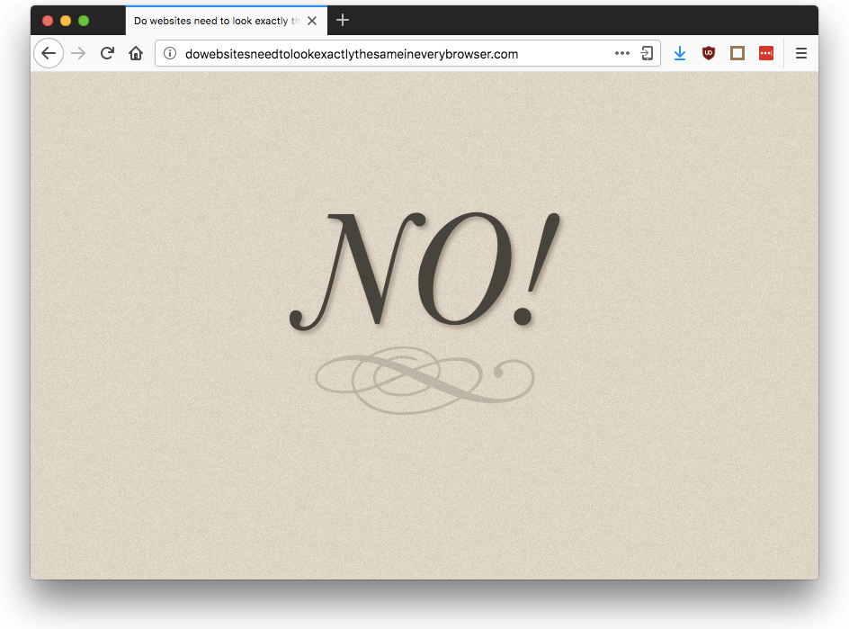
- Pixel perfect layout?
- Same cross-browser experience?
Progressive Enhancement
- Pixel perfect layout?
- Same cross-browser experience?
How?
How?
- Start with 1-column mobile-first layout
- Mobile layout will be fall-back for all browsers
- Use CSS @support to detect grid support
- Apply CSS grid layout as enhancement to simpler layout method
HOW? (contd.)
When container has display:grid. Its children:
- using floats, lose their float behavior
- vertical-align has no effect
- Flex items become grid items
- Block and inline-block become grid items
Example of a 12-column flex fall-back
.grid {
  display: flex;
  flex-wrap: wrap;
  margin: 0 20px;
  display: grid;
  grid-template-columns: repeat(12, 1fr);
  grid-gap: 20px;
}

.grid > * {
  flex: 1 1 25%; /* 1/4 */
  margin: 0 20px 20px 20px;
}So, let's use CSS Grid today!
The End!
Learn more:
- CSS Grid and Grid inspector in Firefox
- gridbyexample.com
- learncssgrid.com
- cssgridgarden.com
- labs.jensimmons.com (CSS Grid examples)
Questions?